Gigapay
Building a brand & a design system
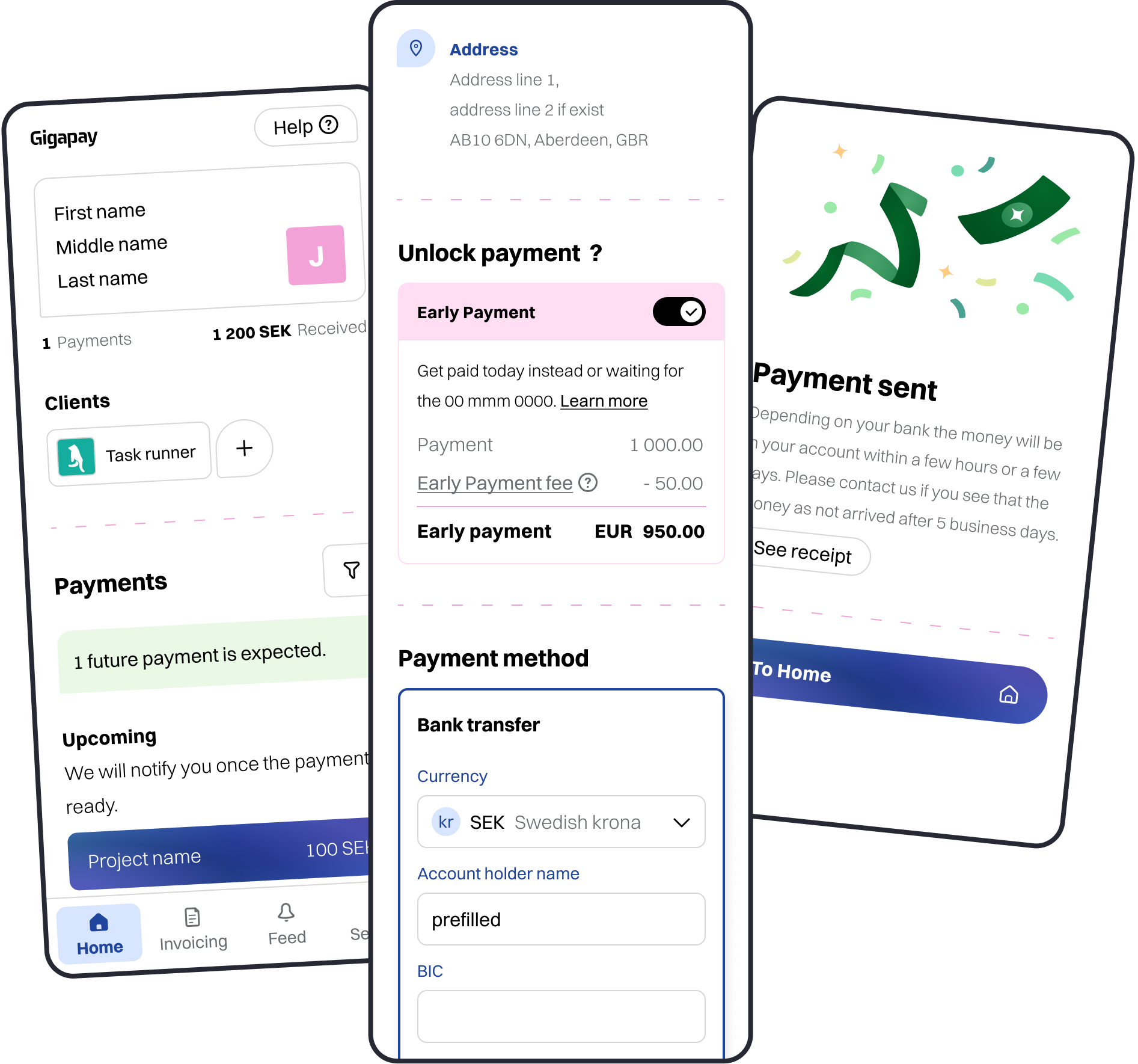
Gigapay is an invoice-consolidation platform that turns marketing campaign payments from enterprises and agencies into micro payouts for individual creators and influencers worldwide.
Solo product designer in a startup setup
3 months — 2023 to 2024
Problem space
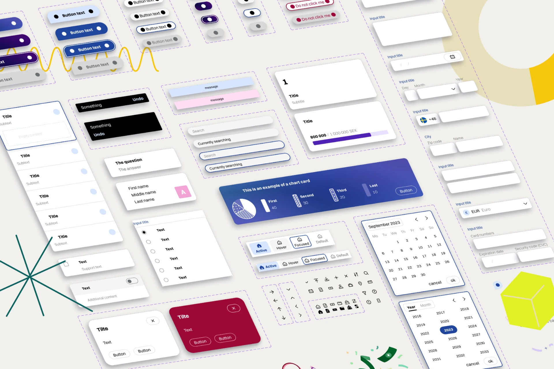
At its core Gigapay is a payment intermediary provider. Accessibility and WCAG compliance was not just a checkmark; it was at the core of every decision and everything I built for the design system. On top of an easy-to-use system, how can we build an experience that feels safe, modern and reliable for the people using our service.
Business strategy
Gigapay had not worked with a designer before, they had no Figma, no product branding, only a theme on their tool coming from agency work done a few years back. They needed to modernise the product branding but most importantly create the foundation for a scalable design system that could bring them into the future. They needed their product to feel modern, safe and reliable.
Brand workshop
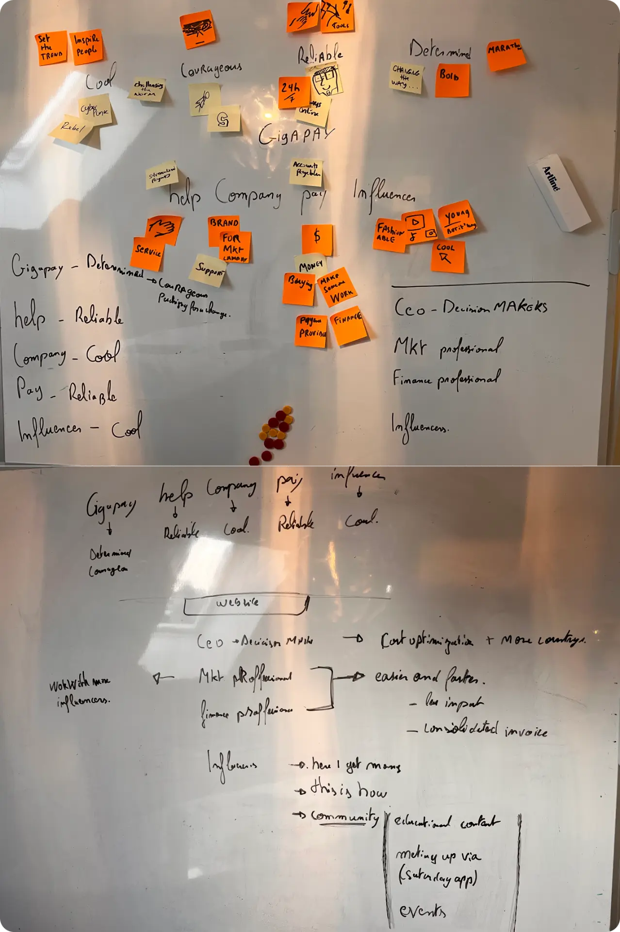
We started the project by laying down with the founder what the new identity of Gigapay was: what is the message, who is visiting our website and using our app, and what type of emotions and feelings we want to convey. Together with the design system we built a new website, brand book and a new international facing identity.

“I wanted to make sure I offered options to the founders and understood their vision and what they wanted to do with the company. A lot of options were on the table. But once we had a decision and started building, I kept to myself to build a human-focused design system that is accessible and relies on best practices shared by other payment infrastructure providers.”
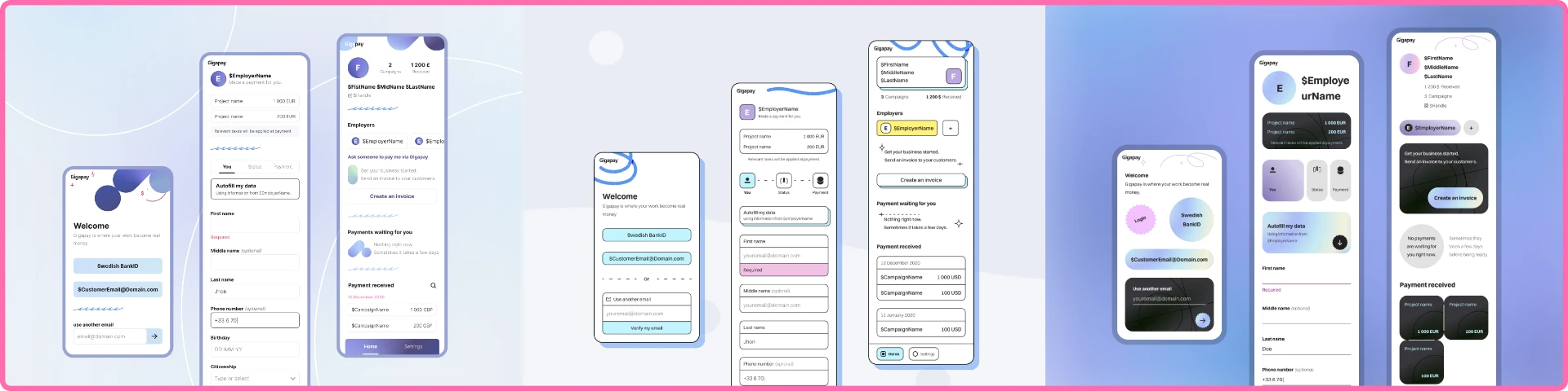
Offering up several looks
It can be hard to make a decision when you don’t see what it would mean. It was important for me to develop several opposite ideas and get them in front of the founding team so they could weigh in on what they mean and what kind of brand feels like them and is in line with the vision for the company.
Outcome
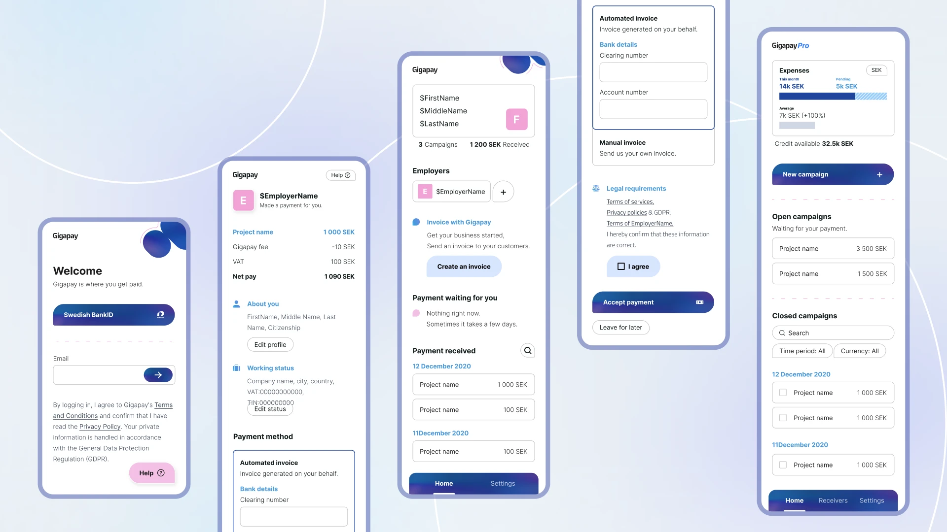
As a result of phase one we had a complete lookbook with key screens on the vision of what the product should look like in the future. This was a perfect guide for phase two, which was building a design system using all available knowledge and best practices. The outcome is that building and customising the product became extremely efficient and fast, both in terms of design and in terms of code. Our solid foundation meant that we only had UX problems to solve after that.
Learnings
Sometimes the marketing material can say one thing, but when it comes to making decisions we can choose something else. What became clear is that while being focused on the creator marketing industry, Gigapay wanted a modern business application that felt serious and solid — something people could feel they can rely on when they are using it.