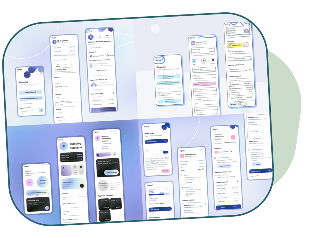
The early focus of gigapay has been to build API access and technical capabilities that allow us to send payments in Sweden and then in the world. It had a front-end experience built based on a few mockups and without a design system. My goals has been to create a solid design foundation.
Having built custom components without a design Gigapay had found itself with a complex, difficult techstack. Any change to design was very time-consuming, the code base was deprecated, and the tool was not compliant with accessibility requirements. On top of these technical challenges, Gigapay was looking to relaunch its commercial brand as an international-focused startup. This created the perfect conditions to create a new design system from scratch.
Creating a new brand
gigapay, wants to be seen as a brand that is courageous, determined, reliable and cool. We work with the creator but handle payments and the global approach selected by the founders and marketing was to aim for a modern corporate look. I proposed several stylesheets and worked with marketing to first establish a brandbook, and new showcase website before going into a new design system.
The challenge
Building a design system without experience with how new design is used is a bit like being Ouroboros (snake eating its tail). I had to build the experience first without a design system and learn from as many external sources as I could to bridge a time, peer review and knowledge gap. Only after the system was completed I could apply to rebuild once more the experience and adjust components to get the maximum efficiency out of them.
Working with delevopers
This project was also the occasion to update the tech stack. The frontend developers chose to rely on modern, accessible and accessible code libraries. While this saves a lot of resources and increases our short-term capabilities this also means that there would be a lot of discrepancy code vs design. I helped bridge that gap by closely following the progress, giving advice, writing design review documents and adapting the components when needed.
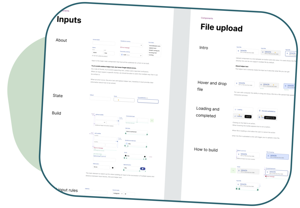
Documenting the system
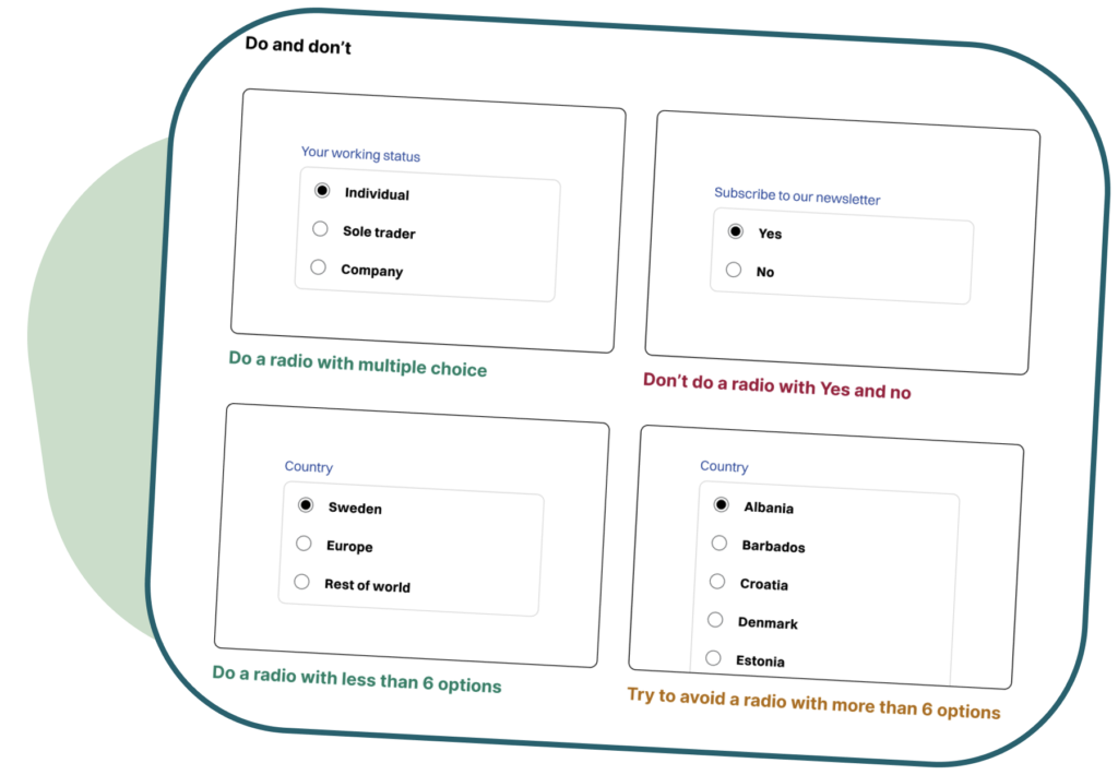
Even if Gigapay is just a startup my aim was for the system to be self-explanatory any other designer or developer could visit Figma and understand how a component is meant to be used, what its limitations what can be done and what should be avoided. This comes from my experience in the bigger design team and I know that this knowledge will be useful for the lifetime of the system.
Result
With our solid and flexible design system, we are now able to redesign our product with best practices and speed. But we are also able to quickly tweak, enhance and expand our product offering. When we learn that a component is underperforming we are also able to perform a quick change and update the entire system. This has greatly reduced the time of design and front-end production.
Learning
A design is a system if not a designer-only resource. I learned that building a design system with developers who are also looking out for external resources and best practices can augment the quality of the final result. It helps bridge the gap between intended and real behaviour. This is something I lacked in a previous project and we had issue about it without understanding where the problem was coming from. Working on this was also a stark confirmation that design systems are fluid and will always be evolving as requirements and possibilities evolve and we should always aim for flexibility.
One of his major contributions was building out our entire UI library. He approached it with such care, professionalism, and an incredible eye for detail, creating something that was not only beautiful but also super practical and scalable. […]. What I also really admired about Jeremie was how he’d always go the extra mile to connect with our customers. He was proactive in seeking out their feedback and insights, […]. As a developer, I also truly appreciated how collaborative he was ; he made sure his designs were not just user-centric but also practical to build.
Navid Asgharzadeh, Frontend Developer @Gigapay
See also
Other projects
Let's meet
I’m curious to hear about your projects & challenges