How to communicate research results with charts and graphics
Help for UX designers trying to share data and research results.
As a student, I’m completely new to the world of UX Research and I quickly realized that via our different quantitative research: we are collecting a large amount of raw data.
This data is not just for us, it is shared with our stakeholder and often represent arguments to explain our decision. Yet, we often tend to extract our graphics straight from our tools (Google forms, Typeform, Zapier, etc) without putting more effort into providing insight from this informations.
I came from a business school where we did 2 years focused on business administration, finance and investment. It turns out we did one type of UX there without even knowing it. It was the science of communicating using charts and graphics. Literally:
“how to convince potential shareholders to invest in our business plan using our research”
Sound familiar? I thought it would be nice to share a bit of these data communication tooltip I have collected over time with you.
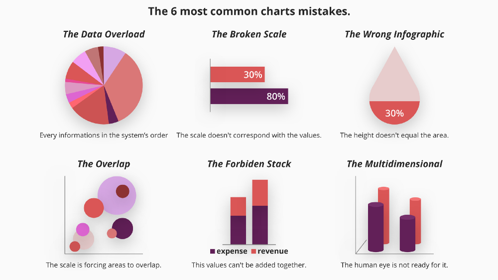
Step one: Identifying the issues.
The best way to do something great would be to first see what it could go wrong with it.
I have formatted here some of the most common mistakes we can easily make on a chart. If you would like to see these errors in real-life content you can read this very good article “The 27 Worst Charts Of All Time”from Business Insider.
We can find those across all type fo charts, the overload, for example, is not limited to pie charts. Choosing a different chart type will not save you from making an error.
I do these mistakes myself, that’s why it is always good to come back and perform a check-up. If your chart doesn’t look like any of those, there if a good chance you have already won the battle.
Step two: What to use when?
Now that we are confident and ready to make our graphic we may wonder, “which one to use?”
There are dozens of chart types out there, and in order to display your specific information, you might even want to create your own and become the founder of a new way to represent data. If you think you need something customized to communicate your results, please do so. It means you’re on the right path: “deliver information, not images”.
Today, I will get you started with some of the most common types of charts and for which purpose you would use them.
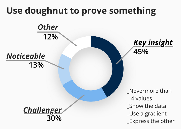
Pie and Doughnut: Prove/verify an idea
With their delicious name, this type of chart is the most common because it is the representation we use to make a decision.
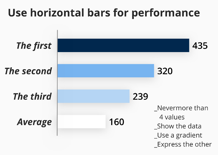
Horizontal bar: Identify the top/worst performance
If you want to showcase the importance of the best/worst elements in your data. Organizing a chart of horizontal bar stack will help you do just that.
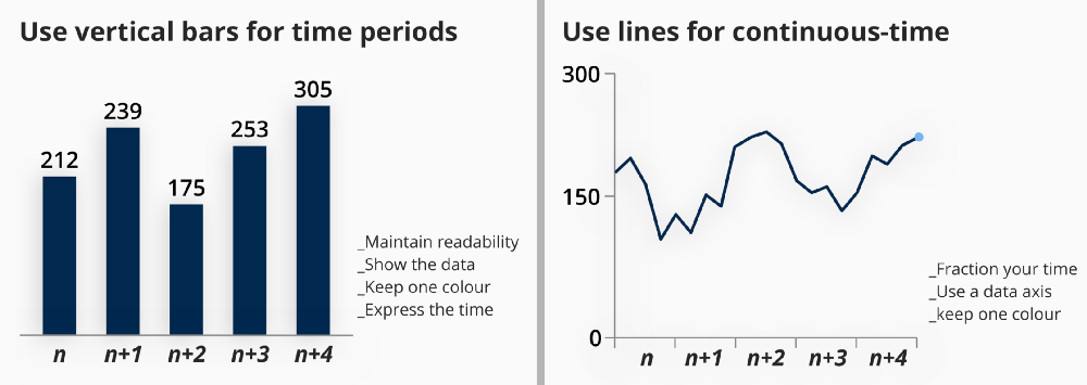
Vertical bar/line: showcase evolution over time.
We read time from right to left and importance from top to bottom. Every time you have to deal with evolution and different stage you should keep the time axis on the horizontal line.
The difference between line and bar would depend if on how well your period can be associated together and how many periods you are trying to showcase. (Ex: you have a year and your data is in days a line will be more useful than 365 bars, but if your data is in quarters, 4 bars will be more readable than a line). The most important thing to remember is readability.
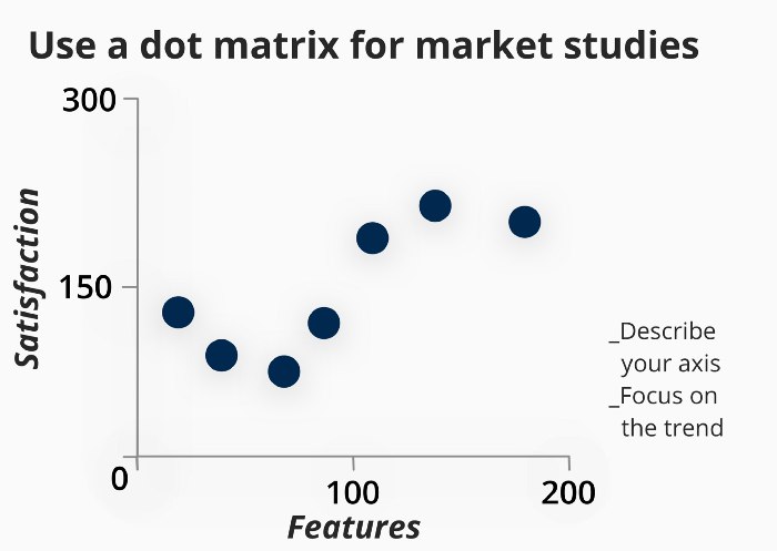
Dot Matrix: study a market/competition
I’m not always a fan of theses representations as they can always be broken down in smaller charts. The important thing for this chart is that you are using two independent series for axis and trying to show something that is not obvious. (Ex: if you put there, quality and price, it is already expected to find a relation, you are not proving anything unless one of the value stands out of the expected trend. Showcasing instead customer satisfaction and a number of features might deliver a piece of information not already known by your audience).
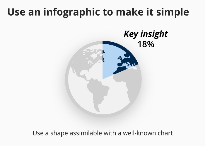
Infographic chart: Connect your data with something real.
Your audience might not be an expert in reading a chart and it might constitute a pain point for them to read extensive dashboards. You can in these situations use an infographic chart. The important here is to maintain a shape that could be assimilated to an existing well-recognised type of chart.
Step 3: Consolidate data, if needed.
With having a lot of simple graphics, you might end up in a situation where you either need to have 2 pieces of information together or provide details on global data. This is why people have invented stacked charts, combo chart, sunburn and other visual contraptions.
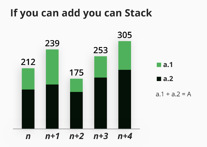
Stacked chart: For additive data
Rule: if you can add values from different series and it still make sense then it’s a GO. (Ex: admin cost + production cost = a bigger cost)
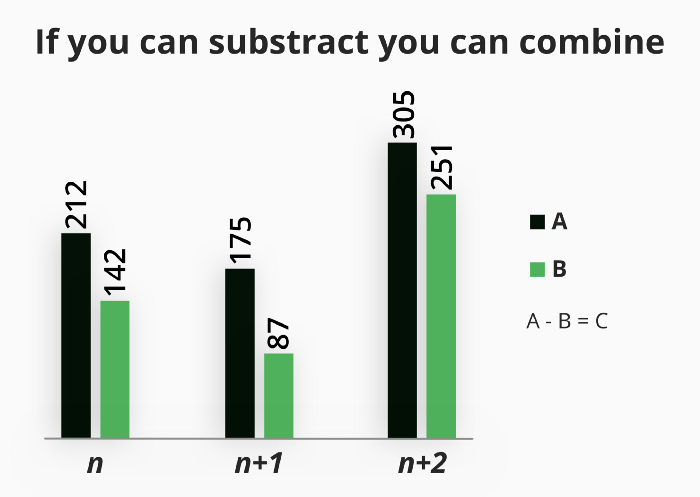
Combined chart: for subtractable data
Rule: if adding value doesn’t make sense but substracting it does then it’s a GO. (Ex: revenue + expenses = a non sense, but revenue — expenses = profit)
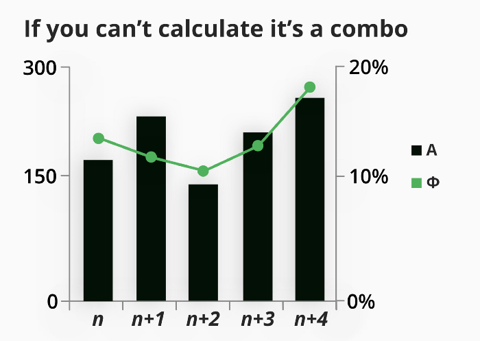
Combo chart: if data is not calculable
Rule: if your data is related but not expressed in the same unit then it’s a GO. (Ex: Revenue and % of margin are related but of different unit)
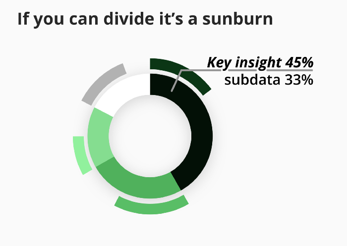
Sunburn: For dividable data
Rule: if you have your data can be divided into a subgroup and stacked chart is not an option, then it’s a GO. (Ex: the % of women customer in each country we sales is a dividable data and a stacked chart is not looking like the best option for it)
One last word on consolidated charts.
This type of graphics can be useful and can be designed to preserve readability, but it’s important to remember your chart must deliver a piece of information. The only case where you would be entitled to create a chart without a clear insight would be for a dashboard where the representation serves a controlling purpose.
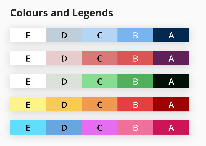
Step 4: colours and legends
Finally, we can make sure our colours and legends are right. There have been many works already done on this matter, I would recommend you to read “Finding the Right Color Palettes for Data Visualizations” from Samantha Zhang on Graphiq
I will simply resume here the best practices: _You should always have a legend and write as much as possible _You should always use a gradient with discernable colours.
Recap
_Make sure your chart is delivering simple information. _Make sure the scale is respected. _Deliver the actual data. _Make sure colour follows a gradient. _Ensure Readability
I hope this article has helped you and you will integrate some of this information on your next presentation, dashboard or document.