Thoughts about a design guideline for Android widgets
What if Material Design also had guidelines for widget experience.
Widgets are a small application interface that a user can choose to implement on the home screen of its phone. They were introduced in 2008 by google and reached their peak popularity around 2017 with Android Oreo. For the user, it represents a way to customize their phone experience and gain quick access to what matters most to them. For app developers widgets offer a way to create an entry point into your app or even be part of the selling features you can offer.
Widget on android have decreased in popularity and at the moment are seen as developers as a useless gimmick that nobody uses.
But widgets are still strong, a 2019 survey from Nextpit show that 65% of android user have more than 2 widgets active on their phone. And recently Apple announced that by the end of 2020 they are about to have a widget party of their own.
We can predict that widget popularity will increase and that developers will get back to the drawing board for their users.
Right now, widgets on android are on a path to failure.
Google themself have not paid attention to widgets for a little while now. We can find google material entries about what widgets can do and how you can code them but nothing has been established about how the experience should be created and what they should look like.
As a result, the majority of people will see clashing styles even among made by google widgets.
Apple is going to make a lot of jealous as they to create a tight set of rules to control the experience of its users. I think the widget party of Apple is going to be even bigger than the one android had in the past, just because it will make sense to see multiple widgets together.
So let’s make Android Widgets better together!
I am not hired by Google (even though sometimes I wished), but this is my plea to create a new entry in material design.
First, let’s have a look at the rules:
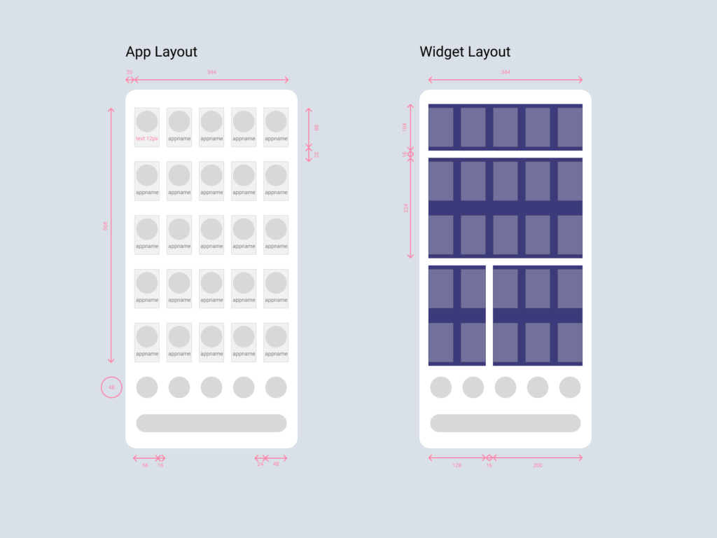
The android standard experience features a customizable screenspace of 568 by 344 px with a grid of 5 by 5 for apps or widgets to be installed.
Important to note that this grid is not a square (like on apple) but somewhat rectangular and that widgets are made to fit with a 16px distance within each other.
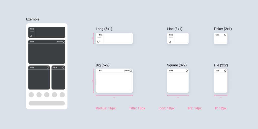
In terms of behaviour, a widget earns by having a title, call to action, and rich content.
Android today lets you build just about anything and it let the user resizes widgets in about any size (unless the developer blocs it. The first rule of our guideline is to establish the bones of every widget. They shall all comply within a set of 6 possible sizes, feature a short title and call to action that is always the same across the entire Android experience.
Widgets and apps come with multiples types and functionality, so we should also define a guide for how the rich content can be implemented.
1. Widgets that feature lists of information.
2. Widgets that feature data representations.
3. Widgets that feature mini tiles.
4. Widgets that feature a rich-media.
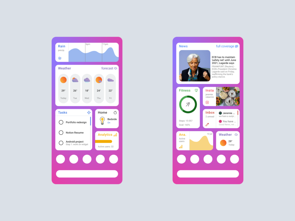
A standard guide for widgets also allows standard conversion into dark mode.
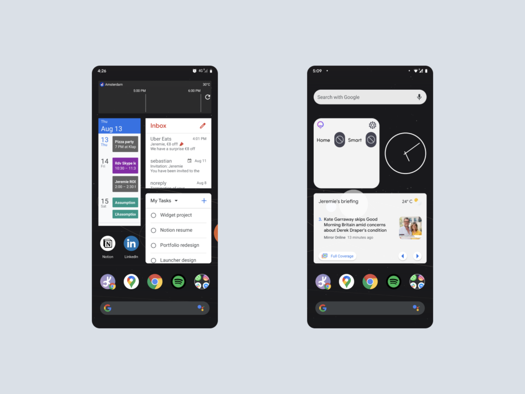
And this is how it could look like on a device
This work could definitely be better
While I am a heavy android user, I have conducted very little research into this piece. In total with the drafting and testing, I spent just about a week into this. And I know that dedicated work could make these widgets even better.
This is just my designer call for google to create a new guide in material design. (hire me)
Of course, we could choose widgets to remain a “free-to-play” on android. But I think just creating a set of guidelines with an easy to implement codebase will invite developers and designers to create widgets that work well together. Widgets are not to be treated as standalone pieces, they are part of the global android experience.